Excellent Responsive Design Resources
With an increasing number of users reading email on mobile devices, it's a no-brainer to provide a better experience for them. Designing your "desktop" email to be more mobile friendly is the most important thing you would do with your campaigns. If you can make it easier for mobile recipients to scan the message, comprehend the content and then act on it, it stands to reason that a responsive design will help with results.
You can optimize the layout by doing things like organizing content into one column and make buttons easier to select, links easier to click and text easier to read. Overall, it's a few hours extra time in HTML for a marked improvement for a significant portion of recipients on your list. And a number of readers who will benefit from it is increasing all the time.
Do you known which email clients most of your subscribers use to open emails? Focusing on the top 3 – 5 most popular email clients is a great first step figuring out where you should spend your time and energy coding HTML for.
Below are valuable resources for you to check for responsive email design and marketing.
Responsive Email Templates for Free Download
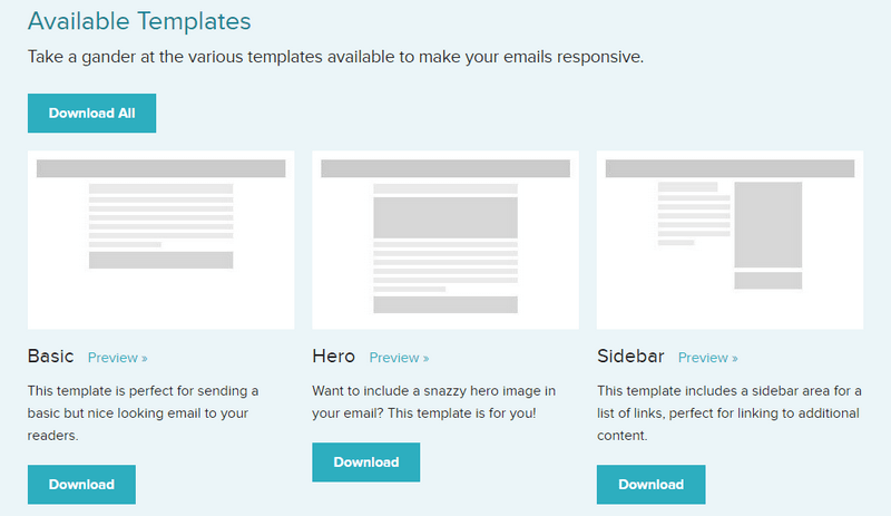
1. ZURB University
This site offers a set of awesome email templates optimized for the majority of email clients that you can use to make your emails responsive.
2. Responsive Email Patterns
Here you can find a collection of patterns and modules for Responsive email newsletters.
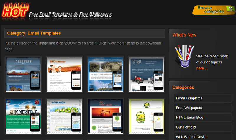
3. Hot Email Templates
A rich library of professionally designed HTML email templates that will give an attractive and eye-catching look to your email newsletters your recipients will appreciate.
4. Cerberus
Cerberus is a small collection of layout patterns for responsive HTML email. The code is meant to be edited, adapted, and built upon. There are two templates, one that relies media queries and one that does not. The templates have been tested in all "popular" email clients.
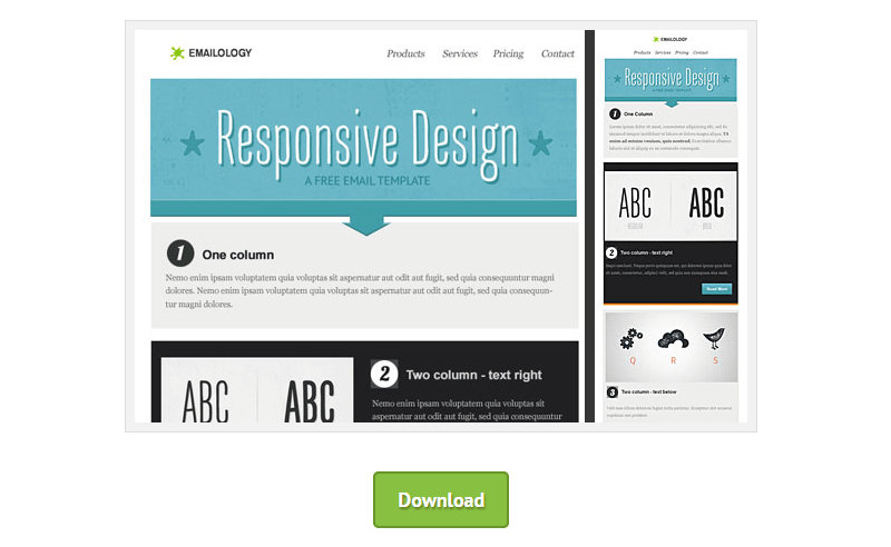
5. Email Blueprints
Provided by MailChimp, Email Blueprints is a collection of HTML email templates that can serve as a solid foundation and starting point for the design of emails. They include template language elements that make them customizable when imported into a MailChimp account, as well as merge tags that will generate dynamic content when sent through MailChimp.
6. Antwort
Antwort offers responsive layouts for email that fit and adapt to client widths. Columns on desktop automatically become rows on mobile.
7. Email on Acide
Their template offers three different "layouts" that trigger based on the width of the screen. By default, it supports 1-3 columns, and as you trigger each media query conditional statement, it converts to a one a column layout for easy reading on mobile devices. You must enter your email address to get the download link.
8. Copernica
If you are looking for some email design inspiration for your next campaign, have a look at the HTML email templates created by the team at Copernica Marketing Software. These templates work in popular email clients such as Apple Mail, Gmail, Thunderbird, and Outlook. And they are optimized for mobile phones too.
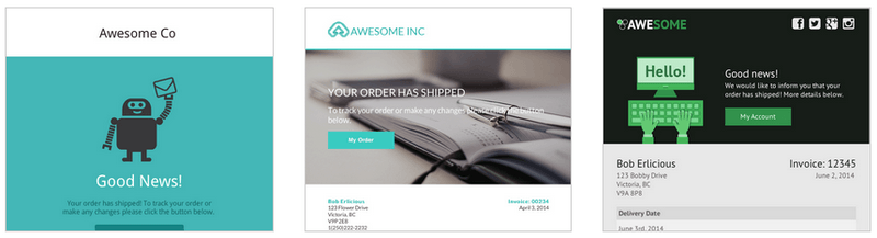
9. SendWithUs
The site offers a collection of free responsive email templates created and managed by the SendWithUs team and community. There are standard templates for use-cases like the receipt, confirmation, welcome emails, and much more. Very useful!
10. Responsive Email Template by Marco Lopes
Marco Lopes, a visual designer at Farfetch.com, made this responsive email template and tested it on Litmus email tester so that it looks all beautiful as well as on iPhone. Feel free to grab it and customize the template as you want, the download file includes all psd's and open source HTML and CSS.
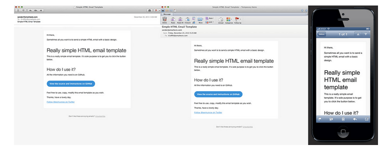
11. Simple Responsive Template
Sometimes all you want is a simple HTML email template. Here it is. Tested on all major email clients. Mobile, desktop and web.
12. Salted Responsive Template
Creating an HTML email that renders well across most clients is surprisingly hard, especially when you want it to be responsive. Salted is a responsive email template that tries to make things easier. Based on code originally developed by Kevin Mandeville and used in the Litmus email newsletters, Salted provides a base on which you can build responsive HTML emails.
Tools for Responsive Email Template Design and Testing
1. Litmus Builder
Streamline your workflow with Litmus web-based email editor! Litmus Builder is continuously improved through contributions from the community — putting new technologies and best practices directly in your hands. It's the world's first code editor built for email designers by email designers.
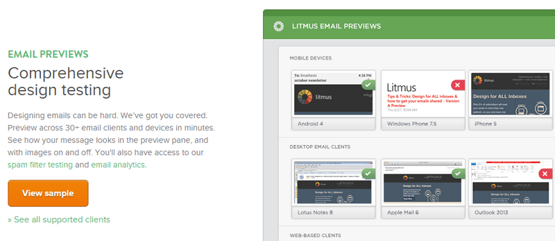
2. Litmus Tester
Does your email look beautiful everywhere? Litmus lets you preview your campaigns across 30+ real email clients and devices in minutes. See how your message looks in the preview pane and with images on and off. You'll also have access to Litmus spam filter testing and email analytics.
3. Campaign Monitor
Choose from a range of designs with flexible layouts to create truly unique looking emails that will work everywhere. Any template you design in Campaign Monitor will automatically be optimized for both desktop and mobile email clients. You can even see how your template will look on a mobile device as you build it.
4. Campaign Monitor CSS Inliner
Writing inline CSS can be a pain. Campaign Monitor built a tool that would do the hard work for you. Just paste your HTML code, and it will move all your styles inline.
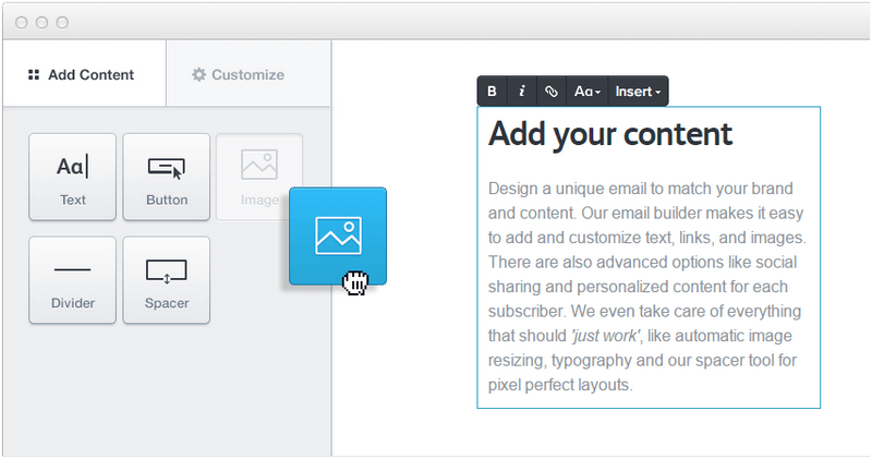
5. BeeFree
BeeFree is a free online email editor that allows you to design stunning, fully responsive emails without the need of any HTML or CSS coding knowledge, and therefore, greatly improving your productivity in the email design creation process.
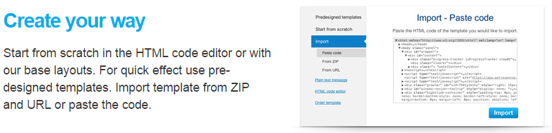
6. GetResponse Email Creator
You can create your email from scratch in the HTML code editor or use pre-designed templates. You can import a template from ZIP and URL or paste the code. With the ultimate drag-and-drop editor, you can make any template one-off and unique, adjust every photo and image to expose best its quality and more. Creative possibilities are limitless!
7. Noble
Noble is clean, modern, and multi-purpose email template and builder. The design is well-polished to be used for any purpose. The layout is responsive which will display beautifully on desktop, tablet, mobile phone, and any device your clients have.
8. Email on Acid
It makes email testing and analytics less complicated. Every email client is different. You can see exactly how your email will look in the most popular Inboxes, so you can fix any problems before you send.
9. Email Checklist
This tool will instantly perform seven quality and best practice checks to ensure your email looks and works the way it should. Just paste your HTML, and let it do the rest.
10. PutsMail
PutsMail allows you to send your HTML to up to 10 email addresses for design testing and debugging.
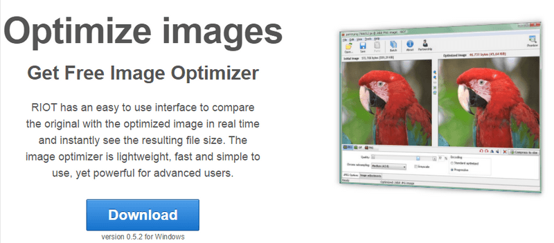
11. RIOT
Radical Image Optimization Tool (RIOT for short) is a free image optimizer that lets you visually adjust compression parameters while keeping minimum filesize. The image optimizer is lightweight, fast and simple to use, yet powerful for advanced users.
12. TinyPNG
TinyPNG uses smart lossy compression techniques to reduce the file size of your PNG files. By selectively decreasing the number of colors in the image, fewer bytes are required to store the data. The effect is nearly invisible, but it makes a very big difference in file size!
Tutorials and Guides
Foundations: Email Coding 101
While coding HTML email uses the same technologies as websites (HTML and CSS), it requires a very specific set of skills to do well. Many web designers try to force web standards on email, resulting in campaigns that render horribly across email clients. To build sturdy emails, you need to code using tables, HTML attributes, and inline styles. This tutorial covers those techniques and gives you a good foundation for building future campaigns.
How to: Code a Responsive Email from Scratch
In this tutorial you can read how to create a responsive email template from scratch at the example of the template Crowder. The template features: mobile responsiveness, web fonts, background images inside table cells.
Creating a Simple Responsive HTML Email
From this tutorial you will learn how to create a simple responsive HTML email that will work in every email client, including all the new smartphone email clients and apps. It uses minimal media queries and a fluid width approach to ensure maximum compatibility.
How to Design a Responsive HTML Email
If you've ever had the misfortune of opening a fixed-width email on a mobile device then you'll understand the need for responsive email design. Screen-bursting, multi-column layouts can appear zoomed out so that font sizes are reduced to the point of illegibility. Clearly, mobile optimization is important but what's the best way to go about it? The answer is in this article.
Making Responsive HTML Emails
This is a run down of the process for designing, building and testing responsive HTML emails. The author also included lots of links to articles and resources for further reading.
Responsive Email Design
In this guide, you will find out why designing for mobile has become a necessary skill for email designers, learn the fundamentals of designing and building a mobile-friendly email and discover some neat tips and techniques.
Mobile Email Compatibility Guide: What Works Where?
While nearly every major mobile operating system has excellent support for HTML and CSS, there are plenty of quirks and idiosyncrasies to worry about. The chart in this article covers some popular email apps for mobile, and mobile email compatibility basics like support for media queries/responsive design, image blocking, preview text, alt text, and more.
Content Choreography In Responsive Email
New CSS layout options (flexbox, grid layouts) and Javascript-based solutions give designers quite a few options to handle the task when it comes to the web. But what about in email, where Javascript simply isn't an option and the necessity of table-based layouts and a lack of common standards means flexbox is only a pipe dream? What can still be accomplished? This article takes a look at a few common design patterns to choreograph content and how they were implemented in an email based environment.
Ideas Behind Responsive Emails
Say you've designed an HTML email with 3 columns. Because of limited and weird CSS support in email clients, email design is done with tables. That 3 column design looks great on large-ish screens, but it squishes awkwardly on small screens. Theoretically a media query would save us here, but as we can't even count on floats we sure can't count on those. There is still a way, though. In this article, the author shares some ideas around responsive email.
Building a System for Responsive Email
This article takes a look at how the MailChimp's in-house email guru Fabio Carneiro designed and built a responsive email template system for other designers and developers to use.
23 Tips for HTML Email Development
Creating HTML emails that are consistent across the majority of email platforms can be a nightmare, with many email programs (Microsoft in particular) having a general disregard for web standards. The HTML email development tips that you will find in this article have been tested on the majority of email programs including Outlook 2007, Outlook 2003, Thunderbird, Apple Mail (Mac and iPhone), Hotmail, Yahoo and Gmail.
Creating Bulletproof Email Buttons
Your emails need to be clean, lean and quick to digest. From this article, you will learn about a great button replacement technique that will limit the number of images your email uses and provide great calls to action regardless of whether images are downloaded.
The Ultimate Guide to Styled ALT Text in Email
A commonly accepted best practice in the email world is the inclusion of alt attributes for images. This article tells how to add a style to alt text and show which email clients support styled alt text for pictures.
iOS: Banning Blue Links
One of the most frustrating challenges designers encounter on iOS is Mail turning phone numbers, addresses, dates, and even random words into links. While this isn't a huge problem for simple transactional emails or plain-text messages, it can become an issue for both branding and readability in marketing campaigns. How do you prevent this behavior on iOS devices? The answer is in the article.
Conclusion
Modern day marketing requires modern day templates and techniques as the templates need to be responsive to scale on any device platform like mobile, tablets, laptops, etc. That's why the majority of companies and brands turn to responsive design techniques to create better experiences for their subscribers, and in many cases, increase their click and engagement rates.
A responsive email design is built upon CSS3 media queries, which can be confusing and complicated to learn. And like everything else in email, they don't work quite the same way in different email clients as they do on the websites. Fortunately, there are numerous HTML email creators, tools and tutorials that can help us with designing beautiful responsive email newsletters. For beginners, the Internet offers collections of free and paid responsive email templates made by professionals that provide compatibility across multiple mail clients including mobile devices.
Popular Articles
Trackback from your site.